My friend, Kitty Korvette, is helming a benefit this month, and when she put out the call for donations to the silent auction, I knew I had to send a few things. Kitty told me that the benefit would be held at Elysium in Austin, and that all things spooky were welcome. I figured that it was time to delve into the Dracula themed box for a good cause!
I started with the outside for this box, and, in a departure from previous boxes, I decided to make the edges look like silver gilded pages and the inside of the box black. I cut out a bat inspired stencil for the front and back covers and a small detail stencil for the corner pieces. Using several shades of grey, I sponge painted over the stencils.

Afterward, I added detail lines with a subdued metal and a bright silver. I used a dark wash of black paint (diluted with flow improver) over the entire outside to tone down the textured look. I also used the wash over the "gilded pages" to play up the grain and emphasize the "paper" edges.

Moving on to the interior, I cut a piece of cardboard the same size as the inside of the box. I covered the cardboard with an upholstery remnant and the glued it into the box as the background layer. Next, I printed out several passages from the Dracula text in various fonts, as if they were clippings. I also cut the corner from a folder to go on top of the clippings in order to stage a spilled folio.
 Once I figured out the arrangement I wanted, I stained the clippings with tea. I was going for an aged look.
 While waiting for the clippings to dry, I tested out the resin with various tints made with glass staining paint. In the end, none of these alone was enough to simulate spilled blood, and I would have to go over the resin, once dry, with straight red stain.
When I added resin to the box, I made sure to have some droplets on the upholstery as well as the papers.
 With the inside complete, I moved on to the spine of the box. I chose a rather detailed font as a guide, but I had to adapt it somewhat to fit in the narrow confines of the spine.
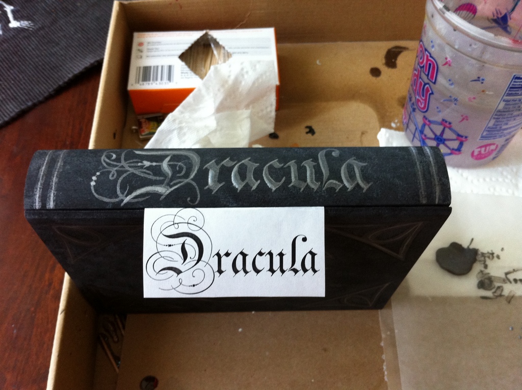 Done!
Done!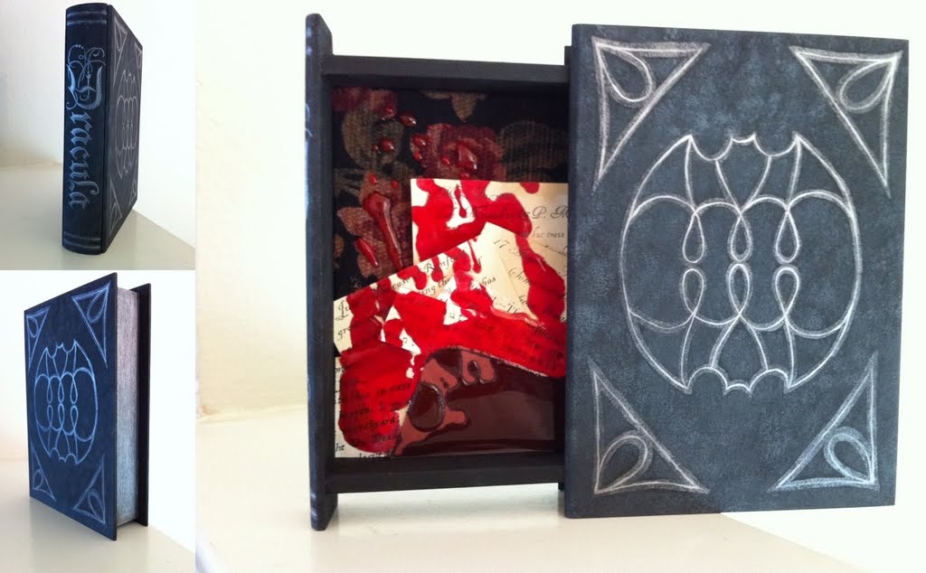
Things to remember:
- Flow improver for acrylics works wonderfully to create a wash with consistent color


