Saturday, July 30, 2011

Book Box no.7 - A Game of Thrones


A Game of Thrones by George R.R. Martin

I must admit, I'm a bit late to the A Song of Ice and Fire party. I've been told many times I would love the books, but I always seemed to pick up something else to read. HBO has me hooked on the story now, and it won't be long before I've devoured each volume of the books. Our house is now filled with George R. R. Martin fans, so I decided it was high time to make a book box for us! Focusing on the first volume, A Game of Thrones, I jumped in with a Stark family dire wolf theme.

I wanted to create a wolf print in snow, so I started by adding the base ground. Using dried tea leaves as dirt and green flock, I created a nice approximation of earth. I added in some finely cut bits of silk floral leaves for grass blades.


Next, I made a mixture of baking soda and elmer's glue for snow, leaving most of the paw uncovered. After the initial paste dried, I went back over all of the snow and area of the paw with a thin layer of glue. On top of this, I poured baking soda, shaking to spread, and pouring out excess. I also had to touch up some of the snow on top of the "earth" with white paint, as the tea leaves ended up staining some of the glue yellow.


I decided to include the family words, "Winter is coming" on a curled ribbon of paper, as if it had been sent via raven. I hand wrote the calligraphy and tea stained the paper. I glued the slip into the box and glued areas of overlap to reinforce the curl.


The outside was painted in progressively lighter shades of gray - the lightest being white - using a sponge, and the page edges were painted in a very bright platinum. Over the page edges, I used a wash of white paint to dull portions of the metallic paint and simulate frost.


Finally, I used dark gray and white to create "cracks" for the front and back images as well as the title on the spine.

Done!


Things to remember:
  • Why buy expensive modeling snow mixture? Make it out of baking soda.
  • Dried tea leaves do look like dirt, but any media put on top may absorb the color and become tea stained.

Sunday, July 24, 2011

Book Box No.6 - The Diary of a Young Girl

The Diary of a Young Girl by Anne Frank

My niece is in love with history. She loves it all - the good... and the bad. She has an unflinching passion for seeking out the events that shaped our world. The holocaust is one of those events, I must confess, that I can not delve into too deeply. I know my history. I honor those who witnessed and endured such horrors, but I do not have the will to study such times. So, I am very proud of my niece, who does. I knew that I needed to make a piece based on the diary of Anne Frank, and I wanted it to carry the great respect I have for Anne Frank's words.
I knew no one would appreciate the box more than Catherine, so I made it for her.

The concept for the box actually came to me before the title. I decided to make a box with walls that opened out. The resulting space, I realized would be a very claustrophobic one, which reminded me of the confines Anne resided in with her family while in hiding.

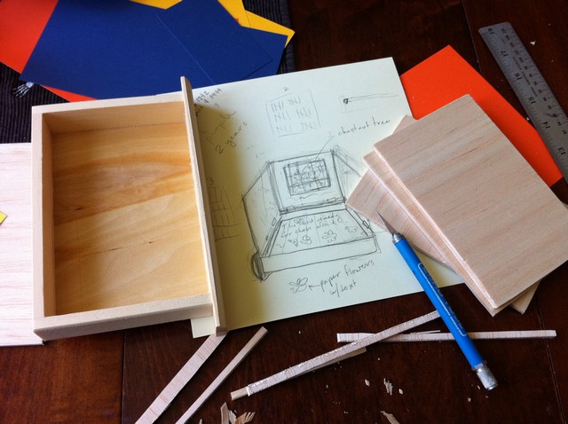
First, I planned out the box. Knowing this particular box would be somewhat of a puzzle to fit together, I sketched out the design and used paper templates to determine the fit of the "doors".
After much planning, I cut the doors out of balsa wood. The box and doors were painted with several coats of antique white paint. I then affixed miniature hinges (as for dollhouses) from the local hobby store to the box and doors with a combination of industrial glue and tiny nails that were included.

Balsa strips were used to maintain the proper distance between layers. A simple brass brad was used to keep the doors/walls upright.

The first doors were painted with stripes reminiscent of the striped uniforms of work camp prisoners.

A second layer, a dark wash, was used to illustrate the row of buildings which included the one Anne in which was housed. I wanted to emphasize that outside of the walls of her sanctuary things were bleak and dangerous.


On the last door, I painted a bookcase. It is a direct reference to the bookcase that hid the doorway to the secret hiding place. I glued black ribbons on either side of the bookcase to aid in lifting the last layer.


Lastly, the room itself was painted in warm tones, as it was her home, albeit for a short time, and a place of safety. The floor was painted in several washes of browns and then was painted with darker lines for texture. I included quotes on the walls, and later glued some small pieces of paper with quotes on the floor.


The outside of the box was painted as a faithful representation of her original diary using cream, red, and tan paints.


This project was undertaken with great love and respect for the subject matter. It weighed on my heart until I could complete it.


Monday, June 27, 2011

Book Box No.5 - Dracula


My friend, Kitty Korvette, is helming a benefit this month, and when she put out the call for donations to the silent auction, I knew I had to send a few things. Kitty told me that the benefit would be held at Elysium in Austin, and that all things spooky were welcome. I figured that it was time to delve into the Dracula themed box for a good cause!

I started with the outside for this box, and, in a departure from previous boxes, I decided to make the edges look like silver gilded pages and the inside of the box black. I cut out a bat inspired stencil for the front and back covers and a small detail stencil for the corner pieces. Using several shades of grey, I sponge painted over the stencils.


Afterward, I added detail lines with a subdued metal and a bright silver. I used a dark wash of black paint (diluted with flow improver) over the entire outside to tone down the textured look. I also used the wash over the "gilded pages" to play up the grain and emphasize the "paper" edges.


Moving on to the interior, I cut a piece of cardboard the same size as the inside of the box. I covered the cardboard with an upholstery remnant and the glued it into the box as the background layer. Next, I printed out several passages from the Dracula text in various fonts, as if they were clippings. I also cut the corner from a folder to go on top of the clippings in order to stage a spilled folio.

Once I figured out the arrangement I wanted, I stained the clippings with tea. I was going for an aged look.

While waiting for the clippings to dry, I tested out the resin with various tints made with glass staining paint. In the end, none of these alone was enough to simulate spilled blood, and I would have to go over the resin, once dry, with straight red stain.


When I added resin to the box, I made sure to have some droplets on the upholstery as well as the papers.

With the inside complete, I moved on to the spine of the box. I chose a rather detailed font as a guide, but I had to adapt it somewhat to fit in the narrow confines of the spine.

Done!


Things to remember:
  • Flow improver for acrylics works wonderfully to create a wash with consistent color

Thursday, June 2, 2011

Book Box No.4 - Hansel and Gretel

***This box does NOT have a home yet. If you would like to purchase it, please check out my listing on Etsy.com. Thanks!***

Hansel and Gretel - recorded by The Brothers Grim

This particular box was inspired by a font. When I was picking a font for The Little Mermaid box, the font for *this* project just seemed so very gingerbread and icing.

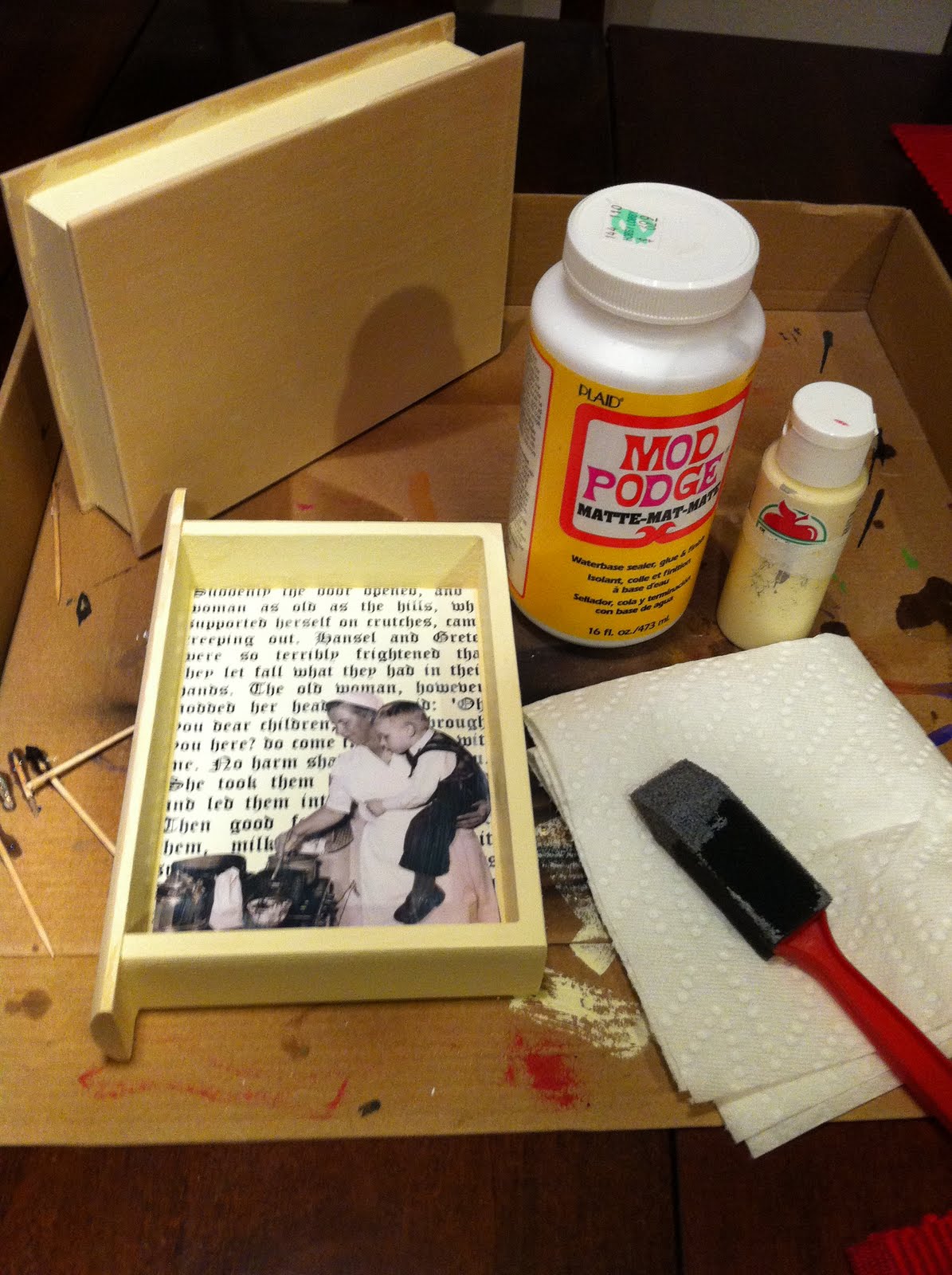
I sealed the image in clear coat spray, and then I decoupaged it into the box on top of the portion of text I previously selected.


Using a silicone ice cube tray as a mold, I made a resin skull with candy embedded. The skull was then glued into the box using industrial glue. I used dimensional paint to simulate royal icing. The outside of the box was painted in three different shades of brown to resemble ginger bread.


Here is the gorgeous font I selected. So pretty! And kinda evil to freehand.

After painting the font and lines on the spine, I still wasn't satisfied with the finished look. It just seemed a little plain.
So, I decided to craft a suitably creepy looking scherenschnitte inspired stencil. After going over the stencil with a slightly darker brown, I was finally pleased with the end product.

Done!
Things to remember:
  • Don't like how it's turning out? Set it aside. Don't stress. Daydream. Then go back to it with fresh eyes and ideas.
  • Dimensional paint will shrink. Be prepared to reapply.
  • When gluing a heavy item into/onto a project, allow it to set overnight or be prepared to deal with shifting.

Friday, April 22, 2011

Book Box No.3 - The Time Traveler's Wife

The Time Traveler's Wife by Audrey Niffenegger

My friend Asia is a multifaceted lady. She's a model, an artist, a mom, and a military spouse. Being a military spouse, she is no stranger to sudden separations from her husband for unpredictable amounts of time. Her favorite book, understandably, is the Time Traveler's Wife. It is a very moving account of an unusual relationship between two people. One, Clare, travels a normal course through time. The other, Henry, has fits of time travel due to a genetic disorder. He has no control over the travel, and it is very perilous.

Because this box was to be for Asia, I wanted to focus on Clare's experience. The quote seemed to choose itself. I knew I wanted to incorporate birds into the box, as they are a recurring theme for Clare. I also wanted to convey the sense of connection the two characters have throughout the book despite geographic, temporal, and, sometimes, communication distances.


My initial idea was to use red map pins, representative of Henry and Clare, and stretch a rubber band between them, thus creating a very physical representation of their bond. The time travel would be represented by stretching the rubber band between black map pins at random points. Good idea right? Ahh...the best laid plans....


I test painted a wooden heart to figure out the color scheme. I wanted to keep the palette close to the one on the predominant book cover - a sea foam blue/green. However, I know that Asia's decor leans more to the Goth side with red, grays, and black. I decided to play down the blue with silver in the hopes that it would tie in with the gray well. I also cut out a stencil to use when applying the silver. I figured an hour glass was appropriate.


I laid in the bottom text background consisting of the years in which Henry time travels.


Using my antique white paint and sea sponge, I muted the dates, and afterward I applied the quote on top using Mod Podge.


Holy cow. That is BLUE.
I won't lie.
A bit of panic was creeping up on me regarding the color.


Several layers of gray, blue, and metallic blue later, I was much more satisfied with the look.


Over the final finish, I applied the silver using the stencils and silver paint. I lightly went over some areas left untouched because of the stencil to tone down the blue even more.


After gluing in the map pins, I mixed up and poured the first layer of resin. The plans was to let one layer set, and then put in the rubber band and birds followed by another layer of resin to keep everything in place.


Alas. The rubber band proved too strong and pulled the map pins out of their resting spaces despite industrial glue and one layer of resin holding them in place. Talk about a strong bond!
In addition to thwarting my composition plans, the rubber band left a transfer of ink. The line was actually quite delicate, and, once I threw my initial tantrum, I liked it.


Here is an illustration of what was supposed to happen:


After playing a bit with string, I decided to reinforce the line with a stronger one of glass stain.


Last, but not least, the title.


First in silver


Followed by metallic blue


And there it is!

Things to remember:
  • Rubber bands are really strong
  • Don't worry. Keep painting.

Wednesday, March 30, 2011

Book Box No.2 - The Little Mermaid

***This box has been purchased and mailed to its new home! Thanks!***


I remember hearing the story of the Little Mermaid a very, very long time ago. Yes, yes, there is a perky little Disney movie, and it is really quite adorable. But! The original, like most old fairy tales, is quite a bit darker. There is some scholarly squabbling over the intended ending, and I found it very humorous that furor over "retcon" is not entirely confined to modern era comics and movies. I prefer the original ending. I found it tragic and yet very compelling as a child.

After playing with resin one day, I realized I must do a book box based on the Andersen tale. The only idea I had going into the project was that I needed to recreate the ocean in a book. I decided to use a section from the tale where the Little Mermaid is making her fateful bargain with the sea witch.

I knew I wanted something to represent the love of the mermaid for her prince, and I struggled with that element for a while. Finally, I imagined the story in a slightly more modern setting, namely the Victorian era. There was so much social constraint in that time period between classes. The mermaid could have been a human scullery maid and still have never had her love. Knowing deviantArt has some wonderful stock images for derivative works, I went searching for a prince.

I found this rather dashing fellow on MementoMori-stock's page.

So armed with my prince, I began work!

First, I painted the inside of my box with a antique white craft paint that is a very close match to the paper I planned on using for the text. I also painted the "page" edges, finishing them with a very diluted wash of dark brown. I used a sponge to soak up the wash in the middle of these sides, leaving the wash in the recesses and edges close to the book cover.
Next, I tackled the spine and cover of the book. I used 3-4 shades of green, building it up with a sea sponge, to get the base color. To develop the scales, I cut a stencil out of heavy cardstock, and, working in off set rows, I sponged on a green metal patina. The cardstock was very saturated at the end; I was worried it might degrade as a stencil, but it managed to make it to the end.

On to the inside!

I glued my text in and sealed it with basic matte Modge Podge. Because it was an inkjet printout, I knew it was going to smear a bit, but, being a book based on water, I felt it was a good effect.

I glued the sand in two layers, as I wanted the gradual buildup of sand in the corner. Once it was completely dry, I mixed up and poured in the first layer of resin. It was lightly tinted using glass stain from the local craft store. I set the box at an angle, so the resin would collect in the corner and simulate the tide washing up onto the shore.

For the next layer, I wanted three things.
1) I wanted more color in the resin.
2) I wanted to get the Prince's image laid in.
3) I wanted to make sea foam.

Two out of three isn't horrible.
See, this resin is design to resist bubbles. Most bubbles that form in mixing can be removed by blowing on the piece lightly. Unfortunately, this makes it difficult to achieve any sort of foam.

(Side note: I did intentionally arrange the photograph so the prince's gaze would point to "grief". I love little details.)

I did try a third, and final, time to get some sea foam. Ultimately, I decided I had to be ok with the results.


Most of this was created by allowing the resin to set slightly and then, using a stirring straw, to create pockets of air and whip in some bubbles. It took quite some effort to get - and keep - the resultant bubbles.

Finally, after all resin was set, I decided on a font. Choosing a font for the spine of a book box can be a tricky process! I printed out the title in a large group and asked for some input from friends. I try to balance the look of the outside with the tone of the text.


I also have to be able to freehand it. I may try transferring it in the future, but the finishes on the box can be very delicate, so I fear transfers may mar surfaces not covered by the lettering. So far, freehand has worked, so I will stick with it for some time. I did the lettering in the same patina as the scales, and, though it almost blends with the scales in some spots, I think the result was very in keeping with the entire project.


DONE!
Things to remember:
  • The more you agitate the resin, the longer it takes to set.